
Multiply
Multiply is a donation app designed to simplify the process of donating unused items and make it more accessible and user-friendly through an intuitive experience.
About the Project
This project was part of a 10 week, in-person UX Design bootcamp at Brainstation in Toronto.
The Problem
The process of donating items can be confusing and cumbersome, with many individuals facing challenges such as a lack of nearby donation centres, long wait times, and complicated procedures. This leads to people choosing to throw away their unwanted items instead of donating them, adding to the problem of overflowing landfills.
The Challenge
How might we make the process of donating more accessible while building a community of like-minded individuals?
The Solution
From research and ideation to UI and prototyping, we designed Multiply to allow users to access all their donation needs from a single platform. The app offers pick-up services, a live map view of donation centres, and a browsing feature to discover local donation events. The goal is to streamline the donation process and make it easier for users to contribute to their community.


Empathize:
Understanding the User
Before beginning the design process, our group needed additional information. In the empathize stage, our focus was to uncover how someone today goes about donating their unused items and what challenges they may face. We interviewed eleven participants who have donated at least once in the past year.
Initial Questions:
-
Tell me about the last time you donated a functional item (excluding money)?
-
What kinds of items do you consider discarding/donating?
-
Tell me an instance where you discarded some items that could have been donated? How did you come to this conclusion?
-
Can you describe what kind of emotions you went through when discarding a functioning item?
-
Describe a time where you thought of donating but you didn’t put it into action. What are some of the reasons?
Research Findings
We were able to validate through our user interviews that people generally feel confused and frustrated with today’s current process around finding donation centers and donating items.
People feel...
-
Unsure where to donate their items
-
Hesitant on what items they can donate
-
The donation process today is cumbersome due to lack of information and process
-
They want to feel more connected to their community
-
A general sentiment of guilt from discarding items were felt from all interviewees
We saw patterns in our interviews and put together an empathy map to help us better understand our users motivations, concerns, and overall user experience.

Competitive Analysis
After gathering data from interviews, our group performed a competitive analysis. We observed several other competitors and noted some of the features they were offering their users.

Define:
Personas
Synthesizing the data from the interviews, we were able to form two distinct user personas. Creating personas helped us visualize the target end-user and their various pain points when it comes to donation activities. To guide us through the design process, we wanted to ensure we created two personas based on the types of people we interviewed:
-
The Power Donator
-
The Power Hoarder


Ideate:
Starting the Design
In the design stage we started with an information architecture sitemap, followed by sketches, then low-fidelity wire frames and finally a high-fidelity prototype.
Information Architecture: Sitemap

Sketches
We started with a few different ideas for what each flow should look like.
For example, we had originally thought it might be a good idea to put a preview of our map view on the homepage. But when we thought of the user needs for simplicity and fast navigation, we changed that in another iteration. In this case we decided it might be more prudent to have only a few hero cards with nearby donation centres for users to choose from, leaving the map as an icon on the bottom of the page, in order to get them started quickly and efficiently.

Prototypes:
Low Fidelity
This low-fidelity prototype, built in Figma connects our wireframes in the user flow for on-boarding/signing in, then then allows for searching and selecting a donation centre through the app. This wireframe contains the interactive links that allow the user to proceed forwards and backwards within the sequence, and the embedded cues for user navigation are clearly indicated.


Testing:
User Testing
Our group conducted user testing using mid-fidelity prototypes with several participants before finalizing our designs with high fidelity mockups.
For our user test we tested 2 flows:
-
Booking a pickup through a donation centre
-
Creating an event
We setup a recorded Zoom call with all of our participants, sent them the link to our prototyped and watched them go through the flow with little guidance as we took notes.
After gathering insights from various users, the following changes were made and displayed below:
Users found the UI design of the live tracker confusing
A few users were unclear about the button hierarchy


Updated the live tracker to show current state
Following interaction design rules, we emphasized the primary button and placed it to the right hand side and underlined the tertiary button
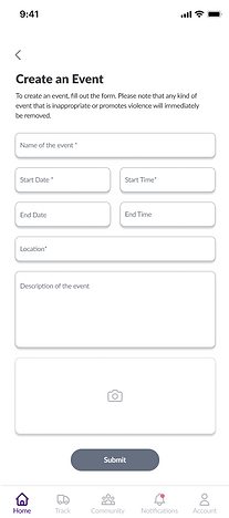
Users found there were too many data fields on this page, this deterred some people from wanting to create an event

Some users were confused by the community button when they were tasked with creating an event
We broke down the event creation page into three pages


We added progress bars to tell users how long the action is taking
We replaced community with events
The Final Design
After reviewing all the feedback we collected, our team got together and worked towards the final designs for our donation app. Click on the ink below to view the final prototype..
Next Steps
To take our ideas to the next level, we could:
-
Integrate with a map platform like Google Maps
-
Animate illustrations to create an interactive experience
-
Develop partnerships with local donation centres and mail out pre-packaged bags, slips, or boxes before scheduled pick-ups
-
Incorporate options for both monetary donations and blood drives, and include expandable maps on the community section
Learnings
We had a blast creating our donation app, and we gained tons of insights into what our users are looking for. As we did more user interviews, we found out that what we initially thought users might want wasn't always spot on which helped us understand the importance of speaking to your users before diving into the ideation phase. During the wire framing and prototyping stages, we figured out that it's very important to make sure everything flows together seamlessly and accurately before moving onto the testing stage with users.
Thank you for reading my case study!
Want to work with me? Feel free to contact me!